Somewhat shamefully I haven’t blogged for a while so I thought I’d put together a quick post about a recent experiment to apply texture to fluid type.
I’m pretty happy with what I’ve managed to achieve with this: by using blend modes and pseudo-selectors to overlay texture on type I’ve managed to create a bespoke, distressed worn font of sorts. Using a mixture of vw units and em’s I was able to ensure the type scaled when required with the distressed effect staying true regardless of viewport width.
Here’s a screengrab of an early iteration, you can view a demo here
Background, ideas and influences
I’ve always had a massive thing for texture in design, especially type; from faded woodblock lettering, low-ink letterpress runs and screen-prints through to Photoshopped work blending multiple layers of distressed tat and ephemera.
Much of this initially came from music and counter-culture – photocopied zines from the punk and hardcore scene, Swifty’s work for Chaser and Mo Wax, David Carson’s Raygun and skate mags such as Kingpin all had a massive influence on me well before I ever began to perceive myself as a creative. As my identity and confidence as a creative front end developer has grown I guess it was only a matter of time before I wanted to try and bring this into the browser.
When I began work on finding a way to apply texture to type I initially couldn’t stop thinking about David Carson’s titling for Blah Blah Blah magazine, though an album sleeve by Swifty and old street signage were influences too. Essentially I wanted to be able to re-create similarly distressed effects and apply these to my own work.
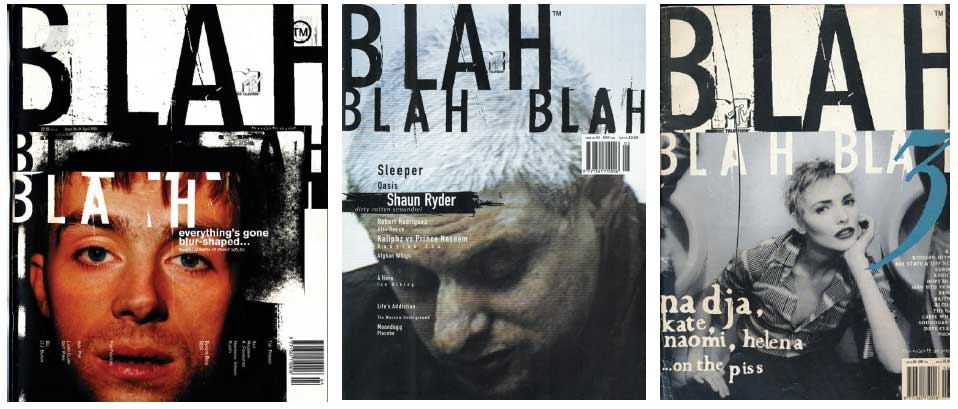
Blah Blah Blah covers from the master.
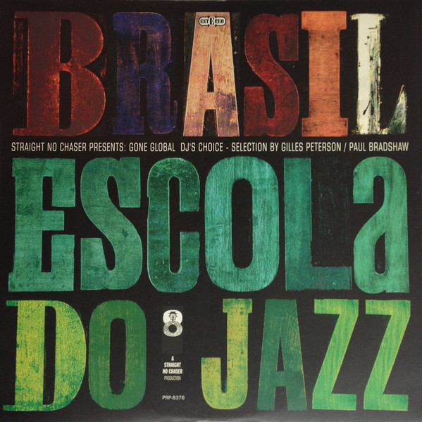
An old Swifty album sleeve for Straight No Chaser Magazine, I love the texture in this, though it was a t-shirt I bought a few years ago featuring this design (black text on red) that partly inspired this post.
Adding the distressed type effect
Adding the distressed or worn effect was reasonably straightforward; having styled the basic h1, I added a pseudo selector to this. I then added a background image to the pseudo selector which I used to apply the texture, I added a hard-light blend mode and some opacity to this to complete the effect. For the background image I used some old photocopied tat that has served me well over the years.
As a caveat, it might sound obvious but make sure the background-size rule comes after background-image in the stack, if it doesn’t you could find the image won’t scale with the type.
Here’s the CSS for the h1 and it’s pseudo element.
h1 {
	position: relative;
	margin-bottom: 1.5rem;
	font-family: 'League Gothic';
	color: #201a92;
	font-size: 48em;
	line-height: .75;
	letter-spacing: -0.037em;
	text-transform: uppercase;
}

h1:after {
	content: 'carson';
	position: absolute;
	left: 0;
	background: url('dc-distressed-bg-1.jpg');
	background-size: cover;
	color: rgba(255, 255, 255, 0);
	mix-blend-mode: hard-light;
}
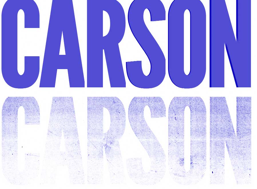
Here’s a quick comparison of the h1 before the pseudo selector is applied and after. I doubt David Carson would ever use League Gothic but hey..
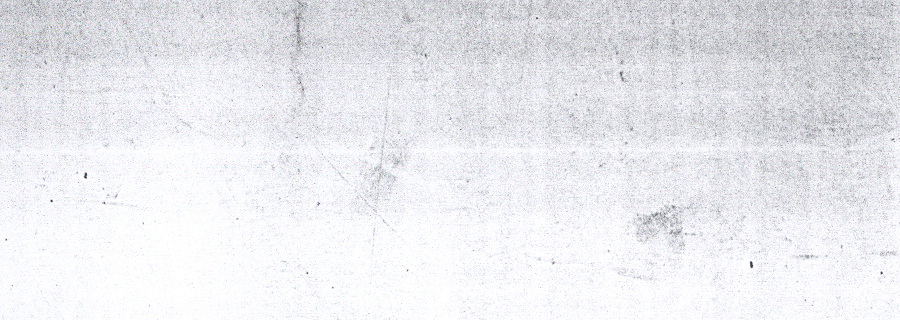
For those of you who are interested, here’s the photocopied tat I overlaid to create the texture;
Incorporating fluid type
Incorporating fluid type on the titling was a breeze. I used one of the methods that served me well in my Blue Notes project and reset font-size to 1vw on the HTML element. When I wanted the text to be fluid I styled it in ems and when I wanted it to be fixed I used a media query to lock font-size in pixels.
Here’s a quick walk-through how I applied fluid type to the titling:
I used an incredibly simple reset, the rule applied to the html element is the important bit here.
* {
padding: 0;
margin: 0;
box-sizing: border-box;
}

html {
font-size: 1vw;
}
Font-size and letter-spacing was set in ems.
h1 {
	position: relative;
	margin-bottom: 1.5rem;
	font-family: 'League Gothic';
	color: #201a92;
	font-size: 48em;
	line-height: .75;
	letter-spacing: -0.037em;
	text-transform: uppercase;
}
Media queries were used to lock font-size in pixels at specific viewport widths. This is essential if the type’s containing element doesn’t fill the screen: given our type was initially reset to VW we need to prevent it continuing to grow as screen size increases, hence the lock and switch to pixels at 900px.
@media (min-width: 900px) {
	h1 {
	    font-size: 430.75px;
	}
}
I styled the blockquote pretty crudely using the methods outlined above, however in production I would always pay more attention to the typography, readability and layout. Whether or not I’d make the blockquote fluid would depend on the design. I’d avoid applying fluid styling to body copy entirely and change font-size, line-height, padding etc with media queries at specific breakpoints.
As a rule of thumb I would only ever use the reset method on titling.
Kerning
To kern individual letters or pairs of letters I wrapped the element(s) I wanted to style in a <b> element, targetted them with nth-of-type selectors and then applied the rules I required to these. Once again when I wanted type to be fluid I used ems and then locked letters in pixels at the screen-width I wanted type to be fixed.
<h1 aria-label="Carson">
	<span aria-hidden="true">
		Ca<b>r</b>s<b>on</b>
	</span>
</h1>
b:nth-of-type(1),
b:nth-of-type(2) {
	letter-spacing: -0.0442em;
	}
Resources
It took a surprising amount of time to find blog posts and pens that helped me truly evolve this as an idea, though as ever CSS tricks proved to be a great starting point, especially a post by Preethi on techniques for knockout text. Mandy Michael’s Relax Pen and her talk on creating text effects with css were incredibly useful and inspirational.
A couple of books I’d recommend for visual inspiration are David Carson’s End of Print (of course) and Ladies of Letterpress, the latter being chock full of faded slabby typefaces!!
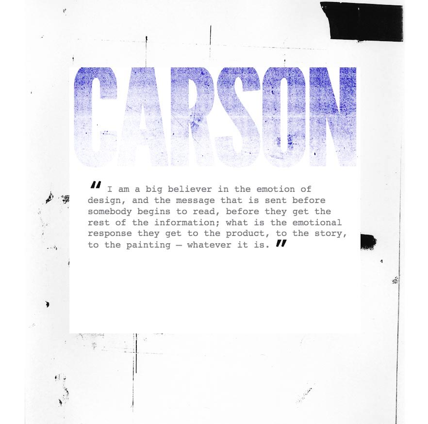
For those of you who might want it the code for all this is below, there’s also a demo of the text scaling in the browser here.
HTML
<div class="container">
	<section>
		<h1 aria-label="Carson"><span aria-hidden="true">Ca<b>r</b>s<b>on</b></span></h1>
	    <blockquote>I am a big believer in the emotion of design, and the message that is sent before somebody begins to read, before they get the rest of the information; what is the emotional response they get to the product, to the story, to the painting – whatever it is.</blockquote>
	</section>
</div>
CSS
* {
	padding: 0;
	margin: 0;
	box-sizing: border-box;
}

html {
	font-size: 1vw;
}

.container {
	width: 100%;
	max-width: 1176px;
	padding-top: 21rem;
	padding-bottom: 100rem;
	margin: 0 auto;
	background-image: url('carson-bg.jpg');
	background-size: contain;
	background-repeat: no-repeat;
	background-blend-mode: multiply;
}

section {
	width: 100%;
	max-width: 900px;
	height: 70rem;
	margin: 0 auto;
	background: #fff;
	overflow: hidden;
}

h1 {
	position: relative;
	margin-bottom: 1.5rem;
	font-family: 'League Gothic';
	color: #201a92;
	font-size: 48em;
	line-height: .75;
	letter-spacing: -0.037em;
	text-transform: uppercase;
}

h1:after {
	content: 'carson';
	position: absolute;
	left: 0;
	background: url('dc-distressed-bg-1.jpg');
	background-size: cover;
	color: rgba(255, 255, 255, 0);
	mix-blend-mode: hard-light;
}

b:nth-of-type(1),
b:nth-of-type(2) {
	letter-spacing: -0.0442em;
}

blockquote { /* NB start blockquote lock at 15 px */
	padding-left: 2.25rem;
	padding-right: 1.25rem;
	font-family: 'courier';
	color: #26282d;
	font-weight: 100;
	font-size: 3.2em;
	line-height: 1.2;
}

blockquote:before {
        content: open-quote;
  	font-size: 3em;
  	color: #444;
  	line-height: 0.1em;
  	margin-right: 0.1em;
  	vertical-align: -0.2em;
}

blockquote:after {
	content: close-quote;
  	font-size: 3em;
  	color: #444;
  	line-height: 0.7em;
  	margin-left: 0.1em;
  	vertical-align: -0.3em;
}

/* ----------------------- locks ------------------------*/

@media (min-width: 900px) {

	.container {
		padding-top: 250px;
	}

	h1 {
		font-size: 430.75px;
	}

	b:nth-of-type(1),
	b:nth-of-type(2) {
		letter-spacing: -19px;
	}

	blockquote {
		font-size: 28.5px;
	}
}

@media (min-width: 1176px) {

    .container {
		padding-top: 246.5px;
	}
}