Over the last few months I’ve been busying myself trying to re-create some of Reid Miles iconic album sleeves in the browser.
As a bit of background Reid Miles was one of the first people to get me into design and thus web developement, it was his work, along with Swifty’s Straight No Chaser, that compelled me to change career and study for an MA in Interactive Multimedia Production way back in Y2K.
Whilst this project was part homage and part test of my chops it was also very much inspired by a desire to try and recreate radically different layouts from those that we see on the web everyday. For those of you that would like to see, use and play with the code for the sleeves I’ve set up a repo here. If you’d like to check out some of the sleeves out on CodePen you can find them here
Layout and design challenge
Where possible I wanted to create semantically sound, accessible code that worked in pretty much every browser, if that wasn’t possible, my baseline was that all the type and layouts should be fluid and responsive.
Fonts and typesetting
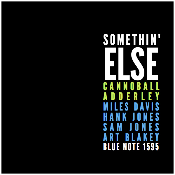
Slabs of type, BIG letters, killer kerning, innovative and juxtaposed placement characterised Reid Miles approach to typography, a process that in many ways sees type become it’s own hero image, in Richard Rutter’s words “a picture that creates an atmosphere and anchors your layout“. Inspired by all this I was keen to try and replicate sleeves I was drawn to with nothing more than CSS and a bit of HTML. Overall it was an incredible buzz being able to focus so intently on type and see the different elements come together on the sleeves. At times, whisper it, I felt like a typographer.
One of the big goals of this project was to learn more about fluid or responsive typography. After some trial and error I was able to incorporate fluid type and kerning on all the sleeves I re-created. I used viewport width as a unit of measurement and css locks to control font-size and letter-spacing, the maths of which I’ve written about below.
Each sleeve had it’s intricacies many of which were often not that readily apparent. As I got stuck into replicating designs I found I often had to control single letters, pairings and small groups of letters, invariably I achieved this with spans. Whilst this felt a little crude it yielded results. The type on ‘Art Blakey And The Jazz Messengers’ consists of a single h1 and multiple spans and remains one my favourite sleeves of those I’ve re-created so far.
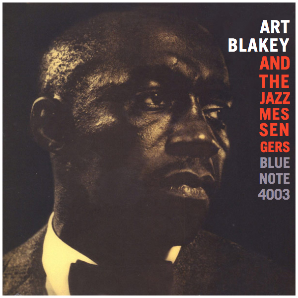
The titling on Art (as this sleeve became affectionately known) consists of a h1 and multiple spans.
As a rule if I had access to the right fonts matching layout was reasonably straight forward, if I didn’t it was often hard to match layouts exactly.
Whilst some fonts or alternatives were readily available, custom weights were often used and couldn’t be sourced. There’s a gorgeous extended light gothic (most likley Trade) used in Feelin’ the Spirit which I just couldn’t find or match. In addition custom letters were often created and then used in conjunction with other fonts, the lip on the ‘R’ on the original version of Sidewinder looks like it was descended from Helvetica, however trying to replicate this proved almost impossible. In an attempt to style individual letters I often experimented with transform 2D which whilst it got me close every now and then didn’t work too well. Letterforms are beautifully crafted things after all and don’t, it turns out, respond that well to relatively crude transforms. As loathe as I was to admit I realised I might have to use SVG to create custom fonts for more challenging type, something I’ll be experimenting with on future sleeves.
Layout
Of the sleeves I choose I felt that layouts fell into two categories; bespoke and house (though I don’t like the word house..). Essentially bespoke sleeves had very unique layouts and very specific development challenges whereas house sleeves often used or re-used common patterns. Development challenges for all the sleeves included; creating fluid background images, matching mark-up to layout in visually and in a way that made sense screen readers, positioning individual typographic elements and incorporating fluid or responsive type.
Hub-Tones, Lee-Way and Cornbread are great examples of the more bespoke layouts, their designs offered great opportunities to explore lesser used CSS properties such as rotate, clipping path and Flexbox’s stretch, on occasion there were some fairly unique challenges with regard to accessibility too.
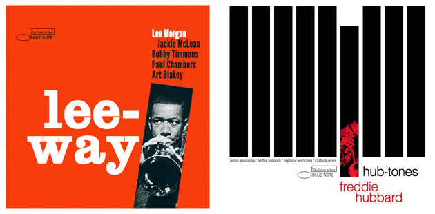
Examples of bespoke layouts
House sleeves used patterns common to other layouts, images would either fill the available space to the point where they became the sleeve or they’d take up a quarter or third of the height whilst spanning full width and leaving plenty of space.
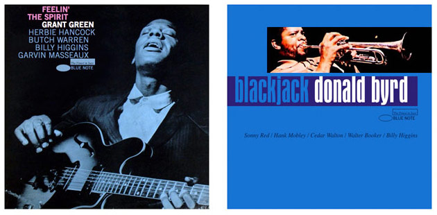
Examples of sleeves that used house or recurring patterns and styles.
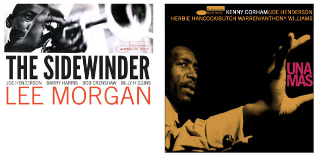
One consistent problem was matching mark-up to layout. The use of contrast, size and placement of type often meant the sleeve would often be read in a slightly different order to it’s actual layout. For example with The Sidewinder we tend to read the title first, followed by the artist’s name and then the band members names. When writing the HTML for this and other sleeves it became obvious I required a means of writing mark-up that would have a logical and hierarchical order that could be correctly interpreted by screen readers whilst also presenting elements in the order required visually. Flexbox provided a brilliant solution to this and other problems.
Images and the the padding-bottom trick
Creating a fluid square that would maintain it’s proportions at any given viewport width was a fundamental requirement for all the sleeves, and whilst its not really a hack, the padding-bottom trick outlined below proved to be an invaluable way of giving an element height without having to specify this in pixels, thus ensuring the container would scale.
Here’s the html for The Cooker (minimal eh?).
<div class="wrapper">
  <div class="container">

    <header>
      <h1 class="the-cooker">The Cooker</h1>
      <h2 class="lee-morgan">Lee<br />Morgan</h2>
    </header>

    <footer class="logo">
      <span class="rectangle"></span>
      <span class="elipse"></span>
      <span class="label">Blue Note</span>
    </footer>

  </div>
</div>
For the CSS, width is defined on the parent (.wrapper) element and no height is specified on either the parent or child element. Instead, height is achieved by setting padding-bottom to 100% on the child (.container) element which also houses the background image.
.wrapper {
    width: 100%;
    max-width: 600px;
    margin: 1rem auto;
    border: 5px solid #fff;
    background-color: #1e0103;
 }

 .container{
    position: relative;
    height: 0;
    padding-bottom: 100%;
    background-image: url('the-cooker.jpg');
    background-size: cover;
 }
Flexbox, document flow and layout
I started experimenting with Flexbox late in the project and this proved to be brilliant at solving some of the layout ordering problems I’d encountered.
As alluded to earlier sometimes I could match (and style) HTML to a specific layout easily. Blackjack is a great examples of this. A quick glance at the sleeve and the necessary mark-up is readily apparent; an inline image, followed by a h1, h2 and h3, in that order. However, as mentioned, there was often a conflict between creating logical mark-up that made sense to screen readers and enabled the desired layout. The Sidewinder was a great example of this.
On The Sidewinder the flex order property allowed me to present content in a different order presentationally to how it was marked up in HTML. As a bonus, the space-between property allowed me to lay out the band members names effortlessly too – perfect!
The HTML below makes sense to a screen reader and is a logical representation of how we interact with the sleeve visually.
<div class="wrapper">
  <div class="container">

    <header>
      <img src="images/sidewinder-main-image.jpg">
    </header>

    <section class="type">
      <h1>The Sidewinder</h1>
      <h2><span>Lee</span> Morgan</h2>
      <h3>Joe Henderson</h3>
      <h3>Barry Harris</h3>
      <h3>Bob Crenshaw</h3>
      <h3>Billy Higgins</h3>
    </section>

  </div>
</div>
Getting the required layout with CSS was as simple as changing the order property. In addition I used space-between to align my h3 elements equally on a horizontal axis, no floats or working out padding or margins for elements!
section {
    display: flex;
    flex-direction: row;
    flex-wrap: wrap;
    justify-content: space-between;
}

section h1 {
    order: 1;
}

section h2 {
    order: 3;
}

section h3 {
    order: 2;
}
Positioning elements
Positioning of titling and other elements (the logo for instance) was usually done in percentages, slightly old school in an age of ems perhaps, but fluid and inherently reliable. Photoshop allowed me to measure the required position to the pixel and conversion was a simple matter of dividing the pixel value into its containing element’s width and multiplying this by a hundred. often it was enough use padding or margins to place individual elements or blocks of text where required.
Responsive typography
One of the primary goals of this project was to get type to scale and look good regardless of viewport width. I used two methods of incorporating fluid responsive type to control font-size and letter-spacing, both involved viewport width as a unit that would scale. Where possible I used the fairly simple approach of re-setting font size to 1vw on the html element and then using ems on individual elements for both font-size and letter-spacing. Where space was tight, and precision paramount I’d opt to use css locks and calc().
The declaration below is all you need to reset your type.. (nifty!)
html {
    font-size: 1vw;
    }
This is all the CSS I needed to scale type on The Cooker. The media query is essential as it stops the type continuing to expand once the sleeve is at its max-width.
.the-cooker {
    margin-bottom: 0.25rem;
    font-size: 4.66em;
    letter-spacing: 0.107em;
    text-align: left;
}

.lee-morgan {
    font-size: 9.35em;
    letter-spacing: 0.0725em;
    text-align: right;
}

@media (min-width: 600px) {

    .the-cooker {
        font-size: 28px;
        letter-spacing: 3px;
    }

    .lee-morgan {
        font-size: 56px;
        letter-spacing: 4px;
    }
 }
I found incorporating calc and locks a little hard to get my head round at first so I thought I’d share how I worked out the calc for the h1 element in The Sidewinder, Florens Verscalde’s excellent blog post proved immensely helpful with this.
Whilst calc can be used without css locks, I found it worked better with locks and was my preferred method of scaling type that was set to the very edge of it’s container.
Essentially locks fix the font-size in pixels at set widths, between these points we use vw as the unit of measure to allow the type to scale smoothly between our locked sizes. We use calc to apply a formula that will increase the font-size between the locks incrementally per unit of viewport width.
On the Sidewinder my first lock was set at 180px and the second was set at 600px. To enable the locks and the associated scaling I set a media query at a min-width of 180px followed by another at a min-width of 600px. As mentioned earlier this second lock is essential to prevent type continuing to grow and blowing out of it’s containing element as the screen widens.
Here’s what the code looks like for the h1 font-size property at the stages outlined above;
/* ------------------------------------------------------------------------
set a base font-size
------------------------------------------------------------------------ */

h1 {
    font-size: 37px;
    }

/* ------------------------------------------------------------------------
set up your first lock, this is the point when the type starts to scale
------------------------------------------------------------------------ */

@media (min-width: 180px) {
    h1 {
        font-size: /* calc() goes here */
    }
  }

/* -------------------------------------------------------------------------------------------
set up your second and in this case final lock, this is the point when the type stops scaling
--------------------------------------------------------------------------------------------  */

@media (min-width: 600px) {
     h1 {
        font-size: 127px;
     }
   }
Once locks have been set, we need to apply the calc() that will enable scaling between the locks.
Here’s the equation that ensured my type scaled between 180 and 600px
calc( 0.2142 * 100vw + -1.556px)
Whilst it looks a little scary, it’s relatively straightforward, here’s how to work it out..
Take the font-size of the element you want to style at your first designated lock, in this case 37px at 180px,
Subtract this from the font size at the second lock 600px, which in this case was 127px. 127px – 37px leaves 90px.
Next subtract the value of the first lock (180) from the second (600), this gives 420. Divide 90 into this. This gives 0.2142.
This gives a crude figure that will allow scaling, however for much tighter control we need to;
Subtract the equation from the original starting font size and then times this by the starting viewport width in the case of this example this gives 37 – 0.2142 * 180
The sum above gives us -1.556px which needs to be added to the equation as below;
font-size: calc( 0.2142 * 100vw + -1.556px)
I used pixels in the above though ems work equally well.
Creating the scaleable Blue Note logo from CSS shapes
I was, I have to confess, quite proud of this.
As the title suggests this how I marked-up and styled the Blue Note logo. Semantically it seemed to work best included as a footer, and whilst it was pretty much the last piece of mark-up in the document flow, presentationally it could appear anywhere on the page.
  <footer class="logo">
      <span class="rectangle"></span>
      <span class="elipse"></span>
      <span class="label">Blue Note</span>
  </footer>
footer {
    position: absolute;
    top: 10%;
    left: 12.25%;
    width: 19%;
    height: 6.3333%;
    color: #000;
}

.rectangle {
    position: relative;
    display: block;
    width: 63.6363%;
    height: 47.3684%; /* 18px / 38px */
    border: 1px solid #000;
    float: right;
}

.rectangle:after {
    content: 'The Finest in Jazz';
    position: absolute;
    bottom: 0;
    font-size: 2px;
    padding-left: 2%;
}

.elipse {
    display: block;
    width: 36.3636%;
    height: 52.6315%; /* 20px / 38px */
    margin-top: 15%;
    margin-right: 0.01%;
    border-radius: 20px / 10px;
    border: 1px solid #000;
    margin-bottom: 8px;
    float: left;
}

.elipse:after {
    content: '';
    padding: 2%;
}

.label {
    padding-top: 3%;
    padding-left: 5%;
    font-family: 'Trade Gothic';
    text-transform: uppercase;
    font-size: 2px;
    font-weight: 400;
    color: #000;
    float: left;
}


/* ------- media queries and locks ------------ */


@media (min-width: 180px) {

    .label {
          font-size: calc(0.0238 * 100vw + -2.28px);
	}

    .rectangle:after {
	  font-size: calc(0.0166 * 100vw + -0.988px);
	}
}

@media (min-width: 600px) {

       .label {
	  font-size: 12px;
	}

       .rectangle:after {
           font-size: 9px;
	}
}
Resources
There are lots of really cool resources out there that inspired and helped me along the way, Jen Simmons talk for Event Apart and Richard Rutter’s article for 24 Ways inspired me to try and make something a little different with typography at it’s core. Florens Verscalde’s excellent blog post proved immensely useful when trying to my head round the maths of calc, Tim Brown’s article got me started with CSS locks. Fonts In Use was a great go-to resource and whilst I couldn’t find a link to a specific post, Zoe Gillenwater’s chapter on Flexbox in Smashing Magazine’s Real-Life Responsive Design was an excellent, easy to implement introduction to what was for me a relatively new technology.
Update
Since originally publishing this post I’ve been recreating a few of the more complex sleeves using CSS Grid with great results and a couple of these can be found on the repo. I’ve started adding texture and worn aged effects to sleeve using CSS filters and blend modes too and have begun to write all of this up here