A little bit blown away that my Blue Notes project is Netmag’s ‘Side project of the month’, I thought I’d put a quick post together detailing some of the updates I’ve been making recently; especially with regard to how I incorporated CSS Grid and used CSS blend modes and filters to create worn and distressed effects.

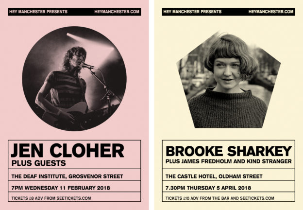
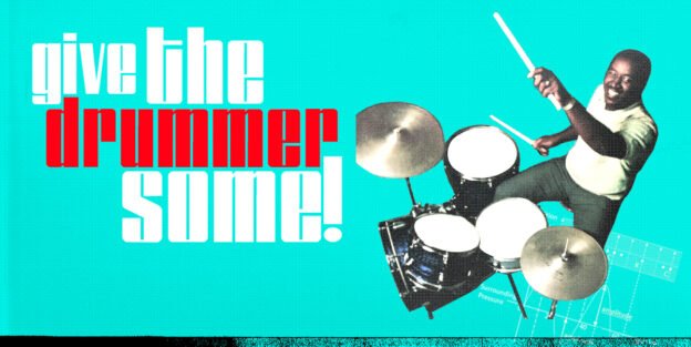
Hey! Manchester flyers re-created in the browser, incorporating CSS clipping paths and blend-modes.

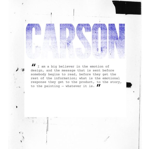
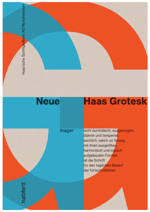
Another type jam this time using blend-modes and photocopied tat to add texture to type and create bespoke, distressed, flexible titling.

I’m at WordCamp London today speaking about how I used Advanced Custom Fields to bring a little bit Photoshop-esque control to the dashboard. Here’s a quick post with links to a gitHub repo containing all the code I used and a short video demo.

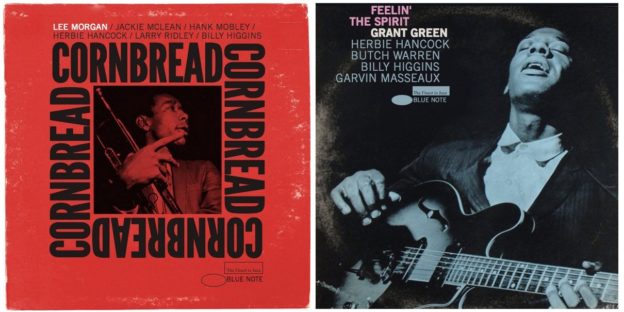
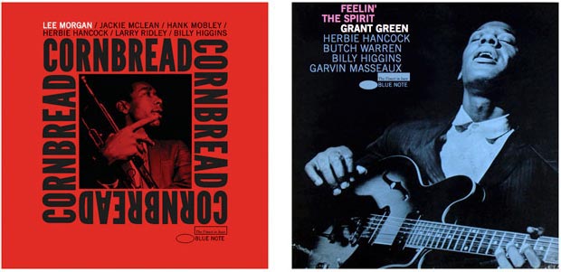
Over the last few months I’ve been busying myself trying to re-create some of Reid Miles iconic album sleeves in the browser.
Part homage and part test of my chops I was inspired by a desire to try and recreate radically different layouts from those that we see on the web everyday. My only baseline was that all the type and layouts should be fluid and responsive.

A quick lunchtime jam incoprating CSS blends, the rotate property and bold typography.

Lately I’ve been rooting through drives full of old artwork, re-connecting with formative ideas and influences
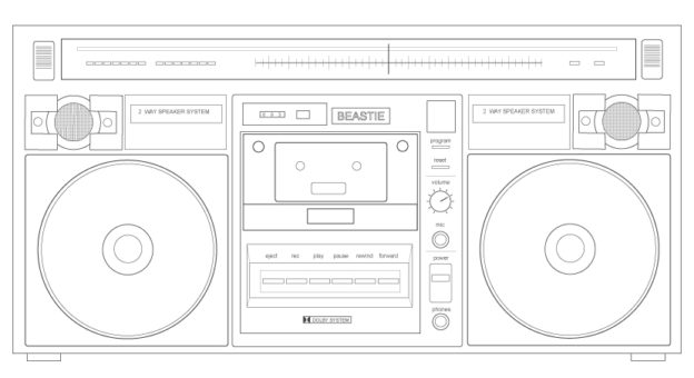
Simple line work in Illustrator was always something I loved to do so I thought I’d share a couple of pieces from my formative days as a designer and developer.

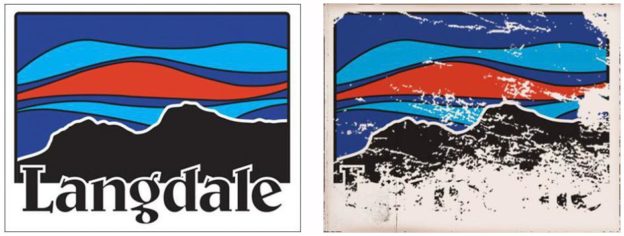
Some graphics made in 2012 whilst living in my van in the Old Dungeon Ghyll car park, inspired by a Patagonia sticker and the view I saw everyday on my way home. A homage to the dirtbag lifestyle, hip-hop and graphic design.
